

coolrasea13
Проверенные
- Сообщения
- 32
- Реакции
- 11
- Баллы
- 65
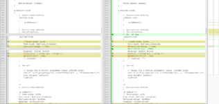
Приветствую. Может кто то знает что поменялось в 2.3.4, а именно с отображением иконок на кнопках. Если в 2.3.4 включить Icon Font - Material Outline, то на всех кнопках иконки дублируются, т.е. сначала отображаются иконки от шрифта Font Awesome и сразу после неё идет иконка от Material Outline. Посмотрев код страницы, там на кнопке используется
Подскажите как избавиться от дублирования иконок при включенном шрифте иконок Material Outline. Я посмотрел файл core_button.less различия между 2.2.17 и 2.3.4 и там есть немало изменений, но я там увидел


fa--xf far fa-check-circle и потом ::before и иконка через svgПодскажите как избавиться от дублирования иконок при включенном шрифте иконок Material Outline. Я посмотрел файл core_button.less различия между 2.2.17 и 2.3.4 и там есть немало изменений, но я там увидел
> .fa--xf svg,, закомментировав его - дублирование иконок пропало, но мне кажется это неправильное решение и может кто подскажет более правильный вариант.
CSS:
// ############################ BUTTONS #################

.button,
button.button
a.button // needed for specificity over a:link
{
    .m-buttonBase();

    .button-text {display: inline-flex; align-items: center;}

    a
    {
        color: inherit;
        text-decoration: none;
    }

    &:hover,
    &:focus {
        .xf-uix_buttonHover();
    }

    &:active {
        .xf-uix_buttonActive();
    }

    .xf-buttonDefault();
    .m-buttonBlockColorVariationSimple(xf-default(@xf-buttonDefault--background-color, transparent));

    &.button--primary
    {
        .xf-buttonPrimary();
        .m-buttonBlockColorVariationSimple(xf-default(@xf-buttonPrimary--background-color, transparent));

        &:hover,
        &:focus {.xf-uix_buttonPrimaryHover();}

        &:active {.xf-uix_buttonPrimaryActive();}
    }

    &.button--cta
    {
        .xf-buttonCta();
        .m-buttonBlockColorVariationSimple(xf-default(@xf-buttonCta--background-color, transparent));

        &:hover,
        &:focus {.xf-uix_buttonCtaHover();}

        &:active {.xf-uix_buttonCtaActive();}
    }

    &.button--link
    {
        // block colors
        // background: @xf-contentBg;
        // color: @xf-linkColor;
        // .m-buttonBorderColorVariation(@xf-borderColor);
        .xf-uix_buttonSmall();
        .xf-uix_buttonLink();

        &:hover,
        &:focus
        {
            text-decoration: none;
            // background: @xf-contentHighlightBg;
            .xf-uix_buttonHover();
        }

        &:active {
            .xf-uix_buttonActive();
        }
    }
    &.button--plain
    {
        background: none;
        color: @xf-linkColor;
        border: none;

        &:hover,
        &:active,
        &:focus
        {
            text-decoration: none;
            background: none;
        }
    }

    &.button--alt
    {
        // block colors
        background-color: @xf-contentHighlightBg;
        color: @xf-linkColor;
        .m-buttonBorderColorVariation(@xf-paletteColor2);

        &:hover,
        &:active,
        &:focus
        {
            background-color: @xf-paletteColor1;
            color: @xf-linkColor;
        }
    }

    &.button--longText
    {
        .m-overflowEllipsis();
        max-width: 100%;
        display: inline-block;
    }

    &.is-disabled
    {
        .xf-buttonDisabled();
        // .m-buttonBorderColorVariation(xf-default(@xf-buttonDisabled--background-color, transparent));

        &:hover,
        &:active,
        &:focus
        {
            .xf-buttonDisabled();
            // background: xf-default(@xf-buttonDisabled--background-color, transparent) !important;
        }
    }

    &.is-hidden
    {
        display: none;
    }

    &.button--scroll
    {
        // background: fade(xf-default(@xf-buttonDefault--background-color, transparent), 75%);
        .xf-buttonPrimary();
        padding: 5px 8px;
        .m-dropShadow();

        &:hover,
        &:focus {.xf-uix_buttonPrimaryHover();}

        &:active {.xf-uix_buttonPrimaryActive();}
    }

    &.button--normal
    {
        font-size: @xf-fontSizeNormal;
    }

    &.button--small
    {
        font-size: @xf-fontSizeSmall;
        padding: 3px 6px;
        .xf-uix_buttonSmall();
    }

    &.button--smaller
    {
        font-size: @xf-fontSizeSmaller;
        padding: 2px 5px;
    }

    &.button--fullWidth
    {
        display: block;
        width: 100%;
        box-sizing: border-box;
    }

    &.button--adminStyleAsset
    {
        &.is-disabled
        {
            visibility: hidden;
        }
        &.is-modify
        {
            .m-buttonIcon(@fa-var-pencil);
        }
        &.is-revert
        {
            .m-buttonIcon(@fa-var-history);
        }
    }

    &.button--wrap
    {
        white-space: normal;
    }

    &.button--icon
    {
        > .button-text:before,
        .button-icon
        {
            .m-faBase();
        }

        > .button-text:before,
        > .fa--xf:before,

        .button-icon
        {
            // font-size: 120%;
            font-size: @xf-uix_iconSize;
            vertical-align: -.1em;

            display: inline-block;
            // margin: -.255em 6px -.255em 0;
            margin-right: .2em;
            // content: '';
        }

        > .fa--xf
        {
            // helps fix a button alignment issue (Chrome only)
            <xf:if is="{{property('uix_iconFontFamily') == 'fontawesome'}}">
            line-height: inherit;
            </xf:if>
        }

        /*
        > .button-text:before
        {
        .m-faBase();
        // font-size: 120%;
        font-size: @xf-uix_iconSize;
        vertical-align: middle;
        display: inline-block;
        // margin: -.255em 6px -.255em 0;
        margin-right: .2em;
    }
        */

        .button-icon
        {
            // height: 1em;
            vertical-align: 0;
        }

        &.button--iconOnly
        {
            > .button-text:before,
            > i.fa--xf:before,

            .button-icon
            {
                margin-left: 0;
                margin-right: 0;
            }
        }

        &.button--padded
        {
            > .button-text:before,
            > i.fa--xf:before,
            .button-icon
            {
                margin-top: 0;
                margin-bottom: 0;
            }
        }

        &--add          { .m-buttonIcon(@fa-var-plus-square, .88em); }
        &--confirm      { .m-buttonIcon(@fa-var-check, 1em); }
        &--write        { .m-buttonIcon(@fa-var-edit, 1.13em); }
        &--import          { .m-buttonIcon(@fa-var-upload, 1.13em); }
        &--export          { .m-buttonIcon(@fa-var-download,  1.13em); }
        &--download        { .m-buttonIcon(@fa-var-download, 1.13em); }
        &--redirect        { .m-buttonIcon(@fa-var-external-link, 1em); }
        &--disable      { .m-buttonIcon(@fa-var-power-off, 1em); }
        &--edit         { .m-buttonIcon(@fa-var-edit, 1.13em); }
        &--save         { .m-buttonIcon(@fa-var-save, .88em); }
        &--reply        { .m-buttonIcon(@fa-var-reply, 1.13em); }
        &--quote        { .m-buttonIcon(@fa-var-quote-left, 1.13em); }
        &--purchase        { .m-buttonIcon(@fa-var-credit-card, 1.13em); }
        &--payment        { .m-buttonIcon(@fa-var-credit-card, 1.13em); }
        &--convert        { .m-buttonIcon(@fa-var-bolt, .75em); }
        &--search        { .m-buttonIcon(@fa-var-search, 1em); }
        &--sort         { .m-buttonIcon(@fa-var-sort, .63em); }
        &--upload        { .m-buttonIcon(@fa-var-upload, 1.13em); }
        &--attach        { .m-buttonIcon(@fa-var-paperclip, 1em); }
        &--login {
            .m-buttonIcon(@fa-var-lock, .88em);
        }
        &--rate         { .m-buttonIcon(@fa-var-star, 1.13em); }
        &--config       { .m-buttonIcon(@fa-var-cog, 1em); }
        &--refresh      { .m-buttonIcon(@fa-var-sync-alt, 1em); }
        &--translate    { .m-buttonIcon(@fa-var-globe, .97em); }
        &--vote         { .m-buttonIcon(@fa-var-check-circle, 1em); }
        &--result       { .m-buttonIcon(@fa-var-chart-bar, 1em); }
        &--history        { .m-buttonIcon(@fa-var-history, 1em); }
        &--cancel       { .m-buttonIcon(@fa-var-ban, 1em); }
        &--close        { .m-buttonIcon(@fa-var-times, .69em); }
        &--preview      { .m-buttonIcon(@fa-var-eye, 1.13em); }
        &--conversation { .m-buttonIcon(@fa-var-comments, 1.13em); }
        &--bolt         { .m-buttonIcon(@fa-var-bolt, .75em); }
        &--list         { .m-buttonIcon(@fa-var-list, 1em); }
        &--prev            { .m-buttonIcon(@fa-var-chevron-left, .63em); }
        &--next            { .m-buttonIcon(@fa-var-chevron-right, .63em); }
        &--markRead     { .m-buttonIcon(@fa-var-check-square, .88em); }
        &--user         { .m-buttonIcon(@fa-var-user, .88em); }
        &--userCircle   { .m-buttonIcon(@fa-var-user-circle, .97em); }

        &--notificationsOn  { .m-buttonIcon(@fa-var-bell, 1.25em); } // actually only .88em, but as we use this as a toggle, make it the same width as bell-slash
        &--notificationsOff { .m-buttonIcon(@fa-var-bell-slash, 1.25em); }

        &--show            { .m-buttonIcon(@fa-var-eye, 1.25em) } // actually only 1.13em, but it's a toggle
        &--hide            { .m-buttonIcon(@fa-var-eye-slash, 1.25em) }

        // for inline mod confirmations
        &--merge { .m-buttonIcon(@fa-var-compress, .88em); }
        &--move { .m-buttonIcon(@fa-var-share, 1.13em); }
        &--copy { .m-buttonIcon(@fa-var-copy, .88em); }
        &--approve, &--unapprove { .m-buttonIcon(@fa-var-shield, 1em); }
        &--delete, &--undelete { .m-buttonIcon(@fa-var-trash-alt, .88em); }
        &--stick, &--unstick { .m-buttonIcon(@fa-var-thumbtack, .75em); }
        &--lock { .m-buttonIcon(@fa-var-lock, .88em); }
        &--unlock { .m-buttonIcon(@fa-var-unlock, .88em); }

        &--bookmark
        {
            .m-buttonIcon(@fa-var-bookmark);

            &.is-bookmarked .button-text:before
            {
                font-weight: @faWeight-solid;
                color: @xf-textColorAttention;
            }
        }
    }

    &.button--provider
    {


        > .button-text:before,
        .button-icon
        {
            .m-faBase('Brands');
            font-size: 120%;
            vertical-align: middle;
            display: inline-block;
            margin: -4px 6px -4px 0;
        }

        .button-icon
        {
            height: 1em;
            vertical-align: 0;
        }


        &--facebook
        {
            .m-buttonColorVariation(#3B5998, white);
            .m-buttonIcon(@fa-var-facebook, 1em);

            .button-text {display: inline;}
        }

        &--twitter
        {
            .m-buttonColorVariation(#1DA1F3, white);
            .m-buttonIcon(@fa-var-twitter, 1em);
        }

        &--google
        {
            .m-buttonColorVariation(white, #444);
            border-color: #e9e9e9;

            > .button-text:before
            {
                display: none;
            }
        }

        &--github
        {
            .m-buttonColorVariation(#666666, white);
            .m-buttonIcon(@fa-var-github, .97em);
        }

        &--linkedin
        {
            .m-buttonColorVariation(#0077b5, white);
            .m-buttonIcon(@fa-var-linkedin, .88em);
        }

        &--microsoft
        {
            .m-buttonColorVariation(#00bcf2, white);
            .m-buttonIcon(@fa-var-windows, .88em);
        }

        &--yahoo
        {
            .m-buttonColorVariation(#410093, white);
            .m-buttonIcon(@fa-var-yahoo, .88em);
        }


    }

    // button-text and button-menu are always children of button--splitTrigger
    // but are defined here for reasons of specificity, as these border colors
    // are overwritten by .m-buttonBorderColorVariation()

    > .button-text { border-right: @xf-borderSize solid transparent; }
    > .button-menu { border-left: @xf-borderSize solid transparent; }

    &.button--splitTrigger
    {
        .m-clearFix();
        padding: 0;
        font-size: 0;
        display: inline-block;

        button.button-text
        {
            background: transparent;
            border: none;
            border-right: @xf-borderSize solid transparent;
            color: inherit;
        }

        > .button-text,
        > .button-menu
        {
            .xf-buttonBase();
            display: inline-block;

            &:hover
            {
                &:after
                {
                    opacity: 1;
                }
            }
        }

        > .button-text
        {
            .m-borderRightRadius(0);
        }

        > .button-menu
        {
            .m-borderLeftRadius(0);
            padding-right: xf-default(@xf-buttonBase--padding-right, 0);// * (2/3);
            padding-left: xf-default(@xf-buttonBase--padding-left, 0);// * (2/3);

            &:after
            {
                .m-menuGadget(); // .58em
                opacity: .5;
            }
        }
    }
}

.buttonGroup
{
    display: inline-block;
    vertical-align: top;
    .m-clearFix();

    &.buttonGroup--aligned
    {
        vertical-align: middle;
    }

    > .button
    {
        float: left;

        &:not(:first-child)
        {
            border-left: none;
        }

        &:not(:first-child):not(:last-child)
        {
            border-radius: 0;
        }

        &:first-child:not(:last-child)
        {
            .m-borderRightRadius(0);
        }

        &:last-child:not(:first-child)
        {
            .m-borderLeftRadius(0);
        }
    }

    > .buttonGroup-buttonWrapper
    {
        float: left;

        &:not(:first-child) > .button
        {
            border-left: none;
        }

        &:not(:first-child):not(:last-child) > .button
        {
            border-radius: 0;
        }

        &:first-child:not(:last-child) > .button
        {
            .m-borderRightRadius(0);
        }

        &:last-child:not(:first-child) > .button
        {
            .m-borderLeftRadius(0);
        }
    }
}

.toggleButton
{
    > input
    {
        display: none;
    }

    > span
    {
        .xf-buttonDisabled();
        .m-buttonBorderColorVariation(xf-default(@xf-buttonDisabled--background-color, transparent));
    }

    &.toggleButton--small > span
    {
        font-size: @xf-fontSizeSmaller;
        padding: @xf-paddingSmall;
    }

    > input:checked + span
    {
        .xf-buttonDefault();
        .m-buttonBlockColorVariationSimple(xf-default(@xf-buttonDefault--background-color, transparent));
    }
}

.u-scrollButtons
{
    position: fixed;
    bottom: 30px;
    <xf:if is="property('uix_fab') == 'always'">
    bottom: 100px;
    <xf:elseif is="property('uix_fab') == 'mobile'" />
    @media(max-width: (@xf-uix_fabVw - 1px) ) {
        bottom: 100px;
    }
    </xf:if>

    <xf:if is="property('uix_fab') != 'never'">
    @media (max-width: @xf-responsiveNarrow) {
        .uix_hasBottomTabs & {bottom: (@xf-paddingLarge + 23px + 100px);}
    }
    </xf:if>

    right: (@xf-pageEdgeSpacer) / 2;
    .has-hiddenscroll &
    {
        right: 20px;
    }
    z-index: @zIndex-9;
    .m-transition(opacity; @xf-animationSpeed);
    opacity: 0;
    display: none;
    &.is-transitioning
    {
        display: flex;
    }
    &.is-active
    {
        display: flex;
        opacity: 1;
    }
    .button
    {
        font-size: 14px;
        display: flex;
        height: 24px;
        line-height: 24px;
        width: 24px;
        border-radius: 100%;
        + .button
        {
            margin-left: @xf-paddingMedium;
        }
    }
}

.u-navButtons
{
    position: fixed;
    bottom: 30px;
    left: (@xf-pageEdgeSpacer) / 2;

    .has-hiddenscroll &
    {
        left: 20px;
    }

    z-index: @zIndex-9;

    .m-transition(opacity; @xf-animationSpeed);
    opacity: 0;
    display: none;

    &.is-transitioning
    {
        display: block;
    }

    &.is-active
    {
        display: block;
        opacity: 1;
    }

    .button
    {
        display: block;

        + .button
        {
            margin-top: (@xf-pageEdgeSpacer) / 2;
        }
    }
}

.block-outer-opposite .button {
    .xf-uix_buttonSmall();
}
Код:
// ############################ BUTTONS #################

.button,
button.button
a.button // needed for specificity over a:link
{
    .m-buttonBase();

    .button-text {display: inline-flex; align-items: center;}

    a
    {
        color: inherit;
        text-decoration: none;
    }

    &:hover,
    &:focus {
        .xf-uix_buttonHover();
    }

    &:active {
        .xf-uix_buttonActive();
    }

    .xf-buttonDefault();
    .m-buttonBlockColorVariationSimple(xf-default(@xf-buttonDefault--background-color, transparent));

    &.button--primary
    {
        .xf-buttonPrimary();
        .m-buttonBlockColorVariationSimple(xf-default(@xf-buttonPrimary--background-color, transparent));

        &:hover,
        &:focus {.xf-uix_buttonPrimaryHover();}

        &:active {.xf-uix_buttonPrimaryActive();}
    }

    &.button--cta
    {
        .xf-buttonCta();
        .m-buttonBlockColorVariationSimple(xf-default(@xf-buttonCta--background-color, transparent));

        &:hover,
        &:focus {.xf-uix_buttonCtaHover();}

        &:active {.xf-uix_buttonCtaActive();}
    }

    &.button--link
    {
        // block colors
        // background: @xf-contentBg;
        // color: @xf-linkColor;
        // .m-buttonBorderColorVariation(@xf-borderColor);
        .xf-uix_buttonSmall();
        .xf-uix_buttonLink();

        &:hover,
        &:focus
        {
            text-decoration: none;
            // background: @xf-contentHighlightBg;
            .xf-uix_buttonHover();
        }

        &:active {
            .xf-uix_buttonActive();
        }
    }
    &.button--plain
    {
        background: none;
        color: @xf-linkColor;
        border: none;

        &:hover,
        &:active,
        &:focus
        {
            text-decoration: none;
            background: none;
        }
    }

    &.button--alt
    {
        // block colors
        background-color: @xf-contentHighlightBg;
        color: @xf-linkColor;
        .m-buttonBorderColorVariation(@xf-paletteColor2);

        &:hover,
        &:active,
        &:focus
        {
            background-color: @xf-paletteColor1;
            color: @xf-linkColor;
        }
    }

    &.button--longText
    {
        .m-overflowEllipsis();
        max-width: 100%;
        display: inline-block;
    }

    &.is-disabled
    {
        .xf-buttonDisabled();
        // .m-buttonBorderColorVariation(xf-default(@xf-buttonDisabled--background-color, transparent));

        &:hover,
        &:active,
        &:focus
        {
            .xf-buttonDisabled();
            // background: xf-default(@xf-buttonDisabled--background-color, transparent) !important;
        }
    }

    &.is-hidden
    {
        display: none;
    }

    &.button--scroll
    {
        // background: fade(xf-default(@xf-buttonDefault--background-color, transparent), 75%);
        .xf-buttonPrimary();
        padding: 5px 8px;
        .m-dropShadow();

        &:hover,
        &:focus {.xf-uix_buttonPrimaryHover();}

        &:active {.xf-uix_buttonPrimaryActive();}
    }

    &.button--normal
    {
        font-size: @xf-fontSizeNormal;
    }

    &.button--small
    {
        font-size: @xf-fontSizeSmall;
        padding: 3px 6px;
        .xf-uix_buttonSmall();
    }

    &.button--smaller
    {
        font-size: @xf-fontSizeSmaller;
        padding: 2px 5px;
    }

    &.button--fullWidth
    {
        display: block;
        width: 100%;
        box-sizing: border-box;
    }

    &.button--adminStyleAsset
    {
        &.is-disabled
        {
            visibility: hidden;
        }
        &.is-modify
        {
            .m-buttonIcon(@fa-var-pencil);
        }
        &.is-revert
        {
            .m-buttonIcon(@fa-var-history);
        }
    }

    &.button--wrap
    {
        white-space: normal;
    }

    &.button--icon
    {
        > .button-text:before,
        .button-icon
        {
            .m-faBase();
        }

        > .button-text:before,
        > .fa--xf:before,
        > .fa--xf svg,
        .button-icon
        {
            //font-size: 120%;
            font-size: @xf-uix_iconSize;
            //vertical-align: -.1em;
            vertical-align: .04em;
            display: inline-block;
            margin: -.255em 6px -.255em 0;
            // margin-right: .2em;
            // content: '';
        }

        > .fa--xf
        {
            // helps fix a button alignment issue (Chrome only)
            <xf:if is="{{property('uix_iconFontFamily') == 'fontawesome'}}">
            line-height: inherit;
            </xf:if>
        }

        /*
        > .button-text:before
        {
        .m-faBase();
        // font-size: 120%;
        font-size: @xf-uix_iconSize;
        vertical-align: middle;
        display: inline-block;
        margin: -.255em 6px -.255em 0;
        // margin-right: .2em;
    }
        */

        .button-icon
        {
            // height: 1em;
            vertical-align: 0;
        }

        &.button--iconOnly
        {
            > .button-text:before,
            > i.fa--xf:before,
            > i.fa--xf svg,
            .button-icon
            {
                margin-left: 0;
                margin-right: 0;
            }
        }

        &.button--padded
        {
            > .button-text:before,
            > i.fa--xf:before,
            .button-icon
            {
                margin-top: 0;
                margin-bottom: 0;
            }
        }

        &--add          { .m-buttonIconWidth(.88em); }
        &--confirm      { .m-buttonIconWidth(1em); }
        &--write        { .m-buttonIconWidth(1.13em); }
        &--import          { .m-buttonIconWidth(1.13em); }
        &--export          { .m-buttonIconWidth( 1.13em); }
        &--download        { .m-buttonIconWidth(1.13em); }
        &--redirect        { .m-buttonIconWidth(1em); }
        &--disable      { .m-buttonIconWidth(1em); }
        &--edit         { .m-buttonIconWidth(1.13em); }
        &--save         { .m-buttonIconWidth(.88em); }
        &--reply        { .m-buttonIconWidth(1.13em); }
        &--quote        { .m-buttonIconWidth(1.13em); }
        &--purchase        { .m-buttonIconWidth(1.13em); }
        &--payment        { .m-buttonIconWidth(1.13em); }
        &--convert        { .m-buttonIconWidth(.75em); }
        &--search        { .m-buttonIconWidth(1em); }
        &--sort         { .m-buttonIconWidth(.63em); }
        &--upload        { .m-buttonIconWidth(1.13em); }
        &--attach        { .m-buttonIconWidth(1em); }
        &--login {
            .m-buttonIconWidth(.88em);
        }
        &--rate         { .m-buttonIconWidth(1.13em); }
        &--config       { .m-buttonIconWidth(1em); }
        &--refresh      { .m-buttonIconWidth(1em); }
        &--translate    { .m-buttonIconWidth(.97em); }
        &--vote         { .m-buttonIconWidth(1em); }
        &--result       { .m-buttonIconWidth(1em); }
        &--history        { .m-buttonIconWidth(1em); }
        &--cancel       { .m-buttonIconWidth(1em); }
        &--close        { .m-buttonIconWidth(.69em); }
        &--preview      { .m-buttonIconWidth(1.13em); }
        &--conversation { .m-buttonIconWidth(1.13em); }
        &--bolt         { .m-buttonIconWidth(.75em); }
        &--list         { .m-buttonIconWidth(1em); }
        &--prev            { .m-buttonIconWidth(.63em); }
        &--next            { .m-buttonIconWidth(.63em); }
        &--markRead     { .m-buttonIconWidth(.88em); }
        &--user         { .m-buttonIconWidth(.88em); }
        &--userCircle   { .m-buttonIconWidth(.97em); }

        &--notificationsOn  { .m-buttonIconWidth(1.25em); } // actually only .88em, but as we use this as a toggle, make it the same width as bell-slash
        &--notificationsOff { .m-buttonIconWidth(1.25em); }

        &--show            { .m-buttonIconWidth(1.25em) } // actually only 1.13em, but it's a toggle
        &--hide            { .m-buttonIconWidth(1.25em) }

        // for inline mod confirmations
        &--merge { .m-buttonIconWidth(.88em); }
        &--move { .m-buttonIconWidth(1.13em); }
        &--copy { .m-buttonIconWidth(.88em); }
        &--approve, &--unapprove { .m-buttonIconWidth(1em); }
        &--delete, &--undelete { .m-buttonIconWidth(.88em); }
        &--stick, &--unstick { .m-buttonIconWidth(.75em); }
        &--lock { .m-buttonIconWidth(.88em); }
        &--unlock { .m-buttonIconWidth(.88em); }

        &--bookmark
        {
            .m-buttonIcon(@fa-var-bookmark);

            &.is-bookmarked
            {
                .m-buttonIcon(@fa-var-solid-bookmark);
                color: @xf-textColorAttention;
            }
        }
    }

    &.button--provider
    {
        > .fa--xf {
            display: none;
        }

        > .button-text:before,
        .button-icon
        {
            .m-faBase('Brands');
            font-size: 120%;
            vertical-align: middle;
            display: inline-block;
            margin: -4px 6px -4px 0;
        }

        .button-icon
        {
            height: 1em;
            vertical-align: 0;
        }

        img.button-icon
        {
            aspect-ratio: 1 / 1;
        }

        &--facebook
        {
            .m-buttonColorVariation(#3B5998, white);
            .m-buttonIcon(@fa-var-facebook, 1em);

            .button-text {display: inline;}
        }

        &--twitter
        {
            .m-buttonColorVariation(#1DA1F3, white);
            .m-buttonIcon(@fa-var-twitter, 1em);
        }

        &--google
        {
            .m-buttonColorVariation(white, #444);
            border-color: #e9e9e9;

            > .button-text:before
            {
                display: none;
            }
        }

        &--github
        {
            .m-buttonColorVariation(#666666, white);
            .m-buttonIcon(@fa-var-github, .97em);
        }

        &--linkedin
        {
            .m-buttonColorVariation(#0077b5, white);
            .m-buttonIcon(@fa-var-linkedin, .88em);
        }

        &--microsoft
        {
            .m-buttonColorVariation(#00bcf2, white);
            .m-buttonIcon(@fa-var-windows, .88em);
        }

        &--yahoo
        {
            .m-buttonColorVariation(#410093, white);
            .m-buttonIcon(@fa-var-yahoo, .88em);
        }

        &--apple
        {
            .m-buttonColorVariation(black, white);
            .m-buttonIcon(@fa-var-apple, .88em);
        }

        &--passkey
        {
            svg
            {
                font-size: 120%;
                vertical-align: .04em;
                display: inline-block;
                margin: -0.255em 0px -0.255em 0;
            }
        }
    }

    // button-text and button-menu are always children of button--splitTrigger
    // but are defined here for reasons of specificity, as these border colors
    // are overwritten by .m-buttonBorderColorVariation()

    > .button-text { border-right: @xf-borderSize solid transparent; }
    > .button-menu { border-left: @xf-borderSize solid transparent; }

    &.button--splitTrigger
    {
        .m-clearFix();
        padding: 0;
        font-size: 0;
        display: inline-block;

        button.button-text
        {
            background: transparent;
            border: none;
            border-right: @xf-borderSize solid transparent;
            color: inherit;
        }

        > .button-text,
        > .button-menu
        {
            .xf-buttonBase();
            display: inline-block;

            &:hover
            {
                &:after
                {
                    opacity: 1;
                }
            }
        }

        > .button-text
        {
            .m-borderRightRadius(0);
        }

        > .button-menu
        {
            .m-borderLeftRadius(0);
            padding-right: xf-default(@xf-buttonBase--padding-right, 0);// * (2/3);
            padding-left: xf-default(@xf-buttonBase--padding-left, 0);// * (2/3);

            &:after
            {
                .m-menuGadget(); // .58em
                opacity: .5;
            }
        }
    }
}

.buttonGroup
{
    display: inline-block;
    vertical-align: top;
    .m-clearFix();

    &.buttonGroup--aligned
    {
        vertical-align: middle;
    }

    > .button
    {
        float: left;

        &:not(:first-child)
        {
            border-left: none;
        }

        &:not(:first-child):not(:last-child)
        {
            border-radius: 0;
        }

        &:first-child:not(:last-child)
        {
            .m-borderRightRadius(0);
        }

        &:last-child:not(:first-child)
        {
            .m-borderLeftRadius(0);
        }
    }

    > .buttonGroup-buttonWrapper
    {
        float: left;

        &:not(:first-child) > .button
        {
            border-left: none;
        }

        &:not(:first-child):not(:last-child) > .button
        {
            border-radius: 0;
        }

        &:first-child:not(:last-child) > .button
        {
            .m-borderRightRadius(0);
        }

        &:last-child:not(:first-child) > .button
        {
            .m-borderLeftRadius(0);
        }
    }
}

.toggleButton
{
    > input
    {
        display: none;
    }

    > span
    {
        .xf-buttonDisabled();
        .m-buttonBorderColorVariation(xf-default(@xf-buttonDisabled--background-color, transparent));
    }

    &.toggleButton--small > span
    {
        font-size: @xf-fontSizeSmaller;
        padding: @xf-paddingSmall;
    }

    > input:checked + span
    {
        .xf-buttonDefault();
        .m-buttonBlockColorVariationSimple(xf-default(@xf-buttonDefault--background-color, transparent));
    }
}

.u-scrollButtons
{
    position: fixed;
    bottom: 30px;
    <xf:if is="property('uix_fab') == 'always'">
    bottom: 100px;
    <xf:elseif is="property('uix_fab') == 'mobile'" />
    @media(max-width: (@xf-uix_fabVw - 1px) ) {
        bottom: 100px;
    }
    </xf:if>

    <xf:if is="property('uix_fab') != 'never'">
    @media (max-width: @xf-responsiveNarrow) {
        .uix_hasBottomTabs & {bottom: (@xf-paddingLarge + 23px + 50px);}
    }
    </xf:if>

    right: (@xf-pageEdgeSpacer) / 2;
    .has-hiddenscroll &
    {
        right: 20px;
    }
    z-index: @zIndex-9;
    .m-transition(opacity; @xf-animationSpeed);
    opacity: 0;
    display: none;
    &.is-transitioning
    {
        display: flex;
    }
    &.is-active
    {
        display: flex;
        opacity: 1;
    }
    .button
    {
        font-size: 14px;
        display: flex;
        height: 24px;
        line-height: 24px;
        width: 24px;
        border-radius: 100%;
        + .button
        {
            margin-left: @xf-paddingMedium;
        }
    }
}

.u-navButtons
{
    position: fixed;
    bottom: 30px;
    left: (@xf-pageEdgeSpacer) / 2;

    .has-hiddenscroll &
    {
        left: 20px;
    }

    z-index: @zIndex-9;

    .m-transition(opacity; @xf-animationSpeed);
    opacity: 0;
    display: none;

    &.is-transitioning
    {
        display: block;
    }

    &.is-active
    {
        display: block;
        opacity: 1;
    }

    .button
    {
        display: block;

        + .button
        {
            margin-top: (@xf-pageEdgeSpacer) / 2;
        }
    }
}

.block-outer-opposite .button {
    .xf-uix_buttonSmall();
}Вложения
Последнее редактирование: